My Works
UX Case Study — Designing a Seamless Real-Estate Booking Experience

01 — Overview
This project reimagines the experience of searching, verifying, and booking properties through a mobile app. The objective was to design a trust-focused, intuitive, and modern real-estate platform where users can browse listings, verify identity securely, explore recommendations, and chat directly with hosts—all inside one unified ecosystem.
The result is a clean, friendly, and immersive booking experience that reduces friction at every step—from identity verification to exploring listings to making a final booking.
02 — Problem
When users book properties online, they frequently face:
Complex onboarding and verification processes
Overwhelming listings with poor categorization
Difficulty comparing options quickly
Poor communication channels between guests and hosts
Low trust due to unclear identity verification workflows
The goal was to solve these issues by designing a frictionless, visually calm, and trust-centered journey.
03 — Research Insights
User Needs
Through analyzing existing real-estate and travel apps (Airbnb, Booking, Oyo), several insights emerged:
Users want simple, fast verification, especially when booking high-value stays.
Category filters need to be quickly accessible (House, Villa, Apartment).
Recommendations improve engagement when they feel personalized and contextual.
Messaging must be familiar, real-time, and human-like.
Map-based browsing is essential for users who prefer discovering properties visually.
Business Needs
Streamlined verification to reduce fraud and build trust
Improved property discovery for higher conversion
Smooth user–host communication to reduce drop-offs
These insights shaped the UX strategy.
04 — UX Strategy
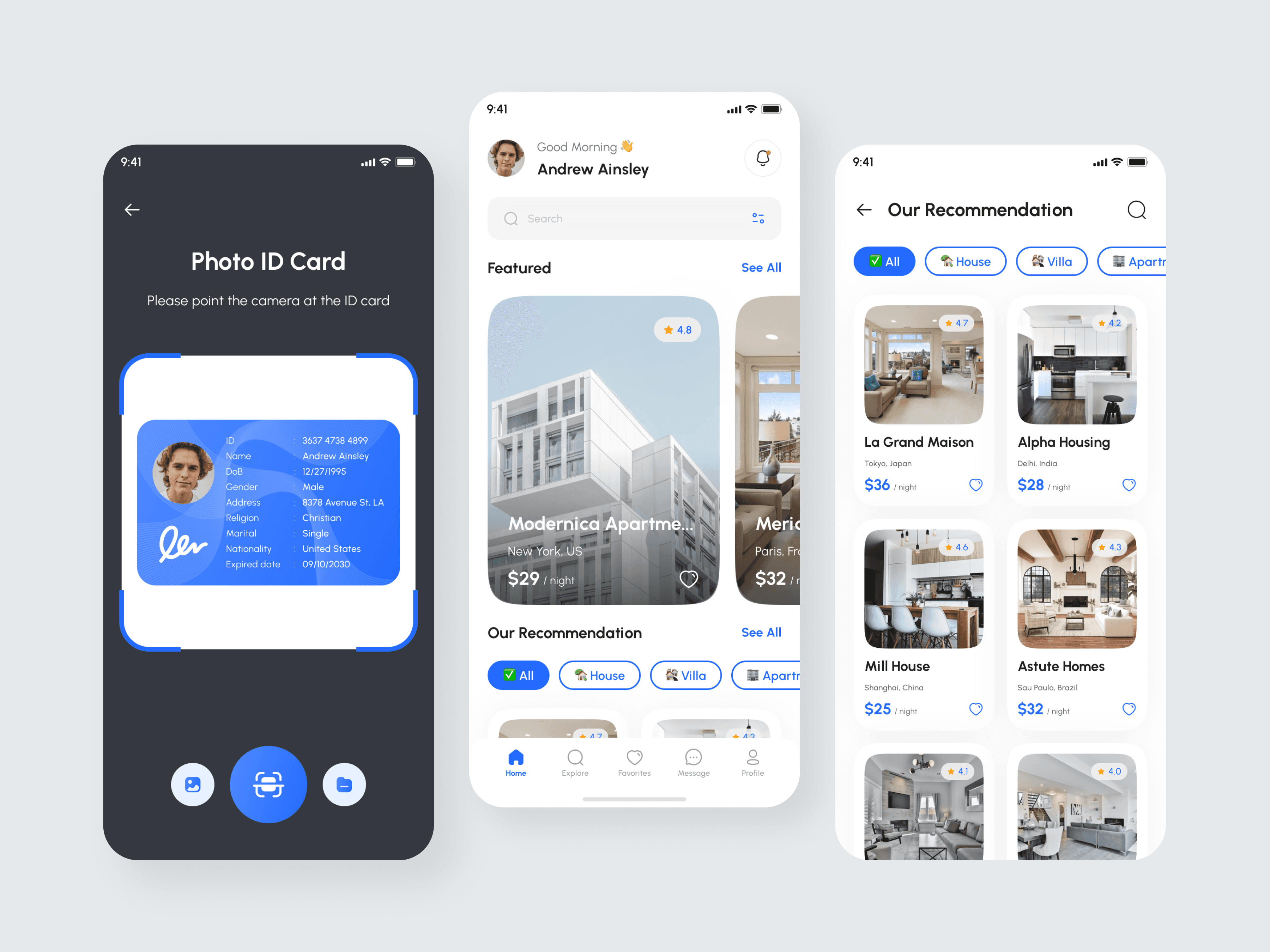
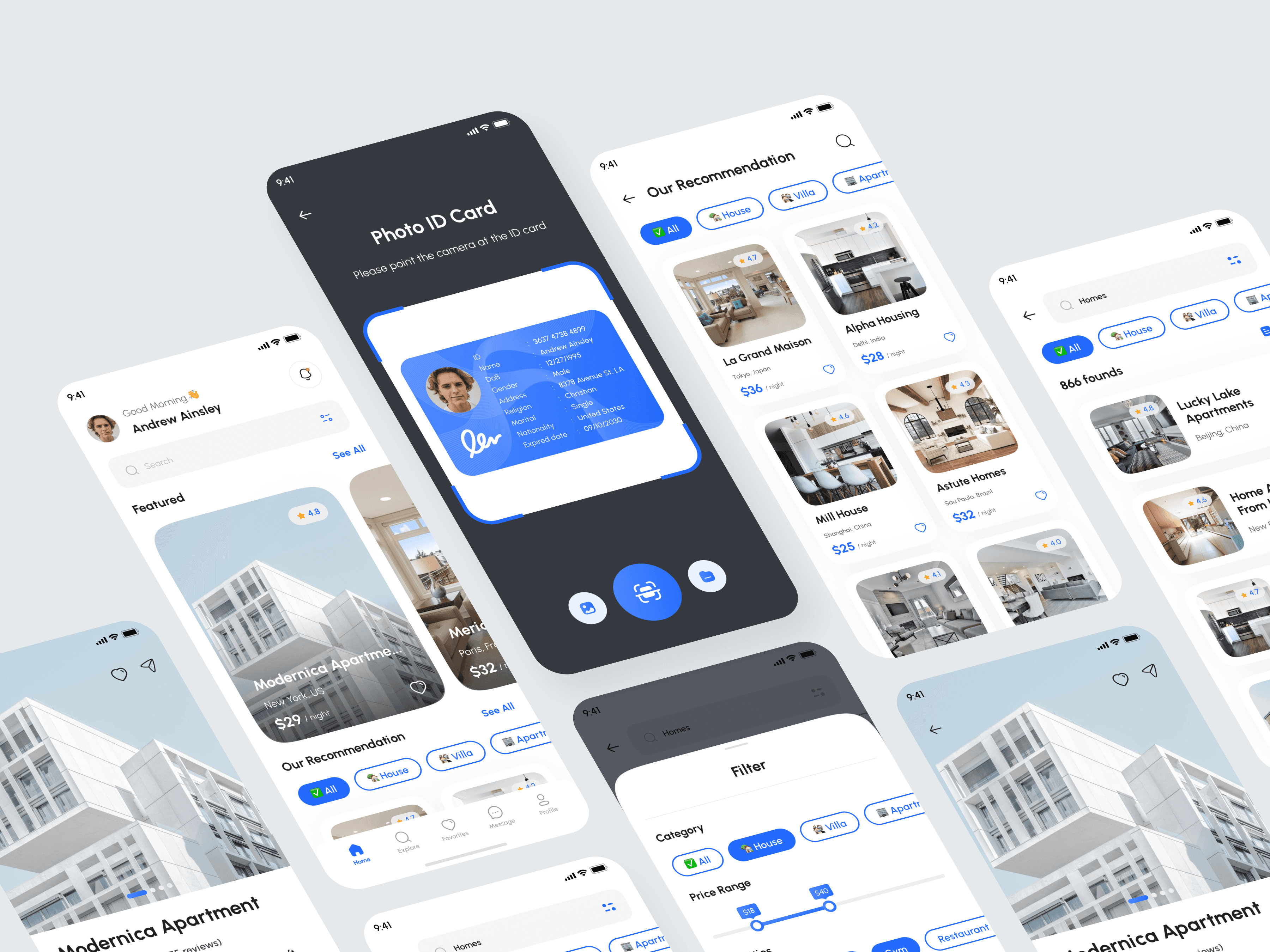
1. A Trust-First Identity Verification Flow
The experience begins with a clean, guided identity check:
A dark background for contrast and focus
Clear instructional text (“Please point the camera at the ID card”)
A glowing scanning frame for visual guidance
Large, intuitive camera and scan buttons
This design reduces anxiety and increases user confidence during verification.
2. A Personalized & Inspiring Home Screen
The home screen is designed to feel welcoming and curated:
A personalized greeting (“Good Morning, Andrew Ainsley”)
A prominent search bar for quick queries
Featured listings with high-quality visuals
A recommendation section tailored by categories
The structure balances exploration with personalization.
3. Smart Browsing With Category Filters
Filters (All, House, Villa, Apartment) appear prominently and remain sticky for easy toggling.
Card-style listings display:
Large images
Ratings
Location
Price per night
This helps users make quick decisions without visual overload.
4. Map-Based Discovery
A map screen allows users to explore properties spatially:
Circular property markers with thumbnails
Highlighted user's current location
Clean map visuals with softened lines
This view simplifies finding options within a desired neighborhood or radius.
5. Human-centric Messaging Experience
The chat system fosters more natural conversation:
Clean bubbles for both sides
Inline property summary at the top
Calendar icons and timestamps for clarity
Quick access to call or video options
This helps users finalize bookings faster with reassuring real-time communication.
6. Consistent & Intuitive Navigation
A bottom navigation bar includes:
Home
Explore
Favorites
Message
Profile
This ensures familiarity and reduces learning time for new users.
05 — Visual Design Decisions
Color Palette
Light, calming neutrals for the main interface
Bold blue accents for actions and interactive elements
Dark background for verification mode
Soft shadows and elevated surfaces for a premium feel
Typography
Clean, modern sans-serif font
Clear hierarchy with bold headings and subtle subtext
Layout
Large cards and images to emphasize property visuals
Rounded components to create a friendly, trustworthy tone
Balanced whitespace to reduce cognitive load
Iconography
Simple, universal icons for easy understanding
Blue icons during ID scan for visual focus
06 — Outcome

The final design creates a fluid end-to-end experience:
✓ Faster and clearer identity verification
✓ Personalized and welcoming home experience
✓ Scannable listings with strong visual hierarchy
✓ Intuitive category filtering and map exploration
✓ Real-time messaging that strengthens host–guest trust
✓ A consistent interface built around comfort and clarity
This results in a booking experience that is secure, engaging, and enjoyable.
07 — Reflection
This project strengthened my UX approach in:
Designing trust-sensitive flows
Balancing visual appeal with usability
Creating experiences for high-consideration decisions
Understanding the emotional side of booking and travel
Structuring information for clarity and speed
The result is a user journey that feels modern, human-centered, and highly functional—ideal for a next-generation rental platform.