My Works
Designing a High-Conversion Lead Generation Platform for InWorks

Overview
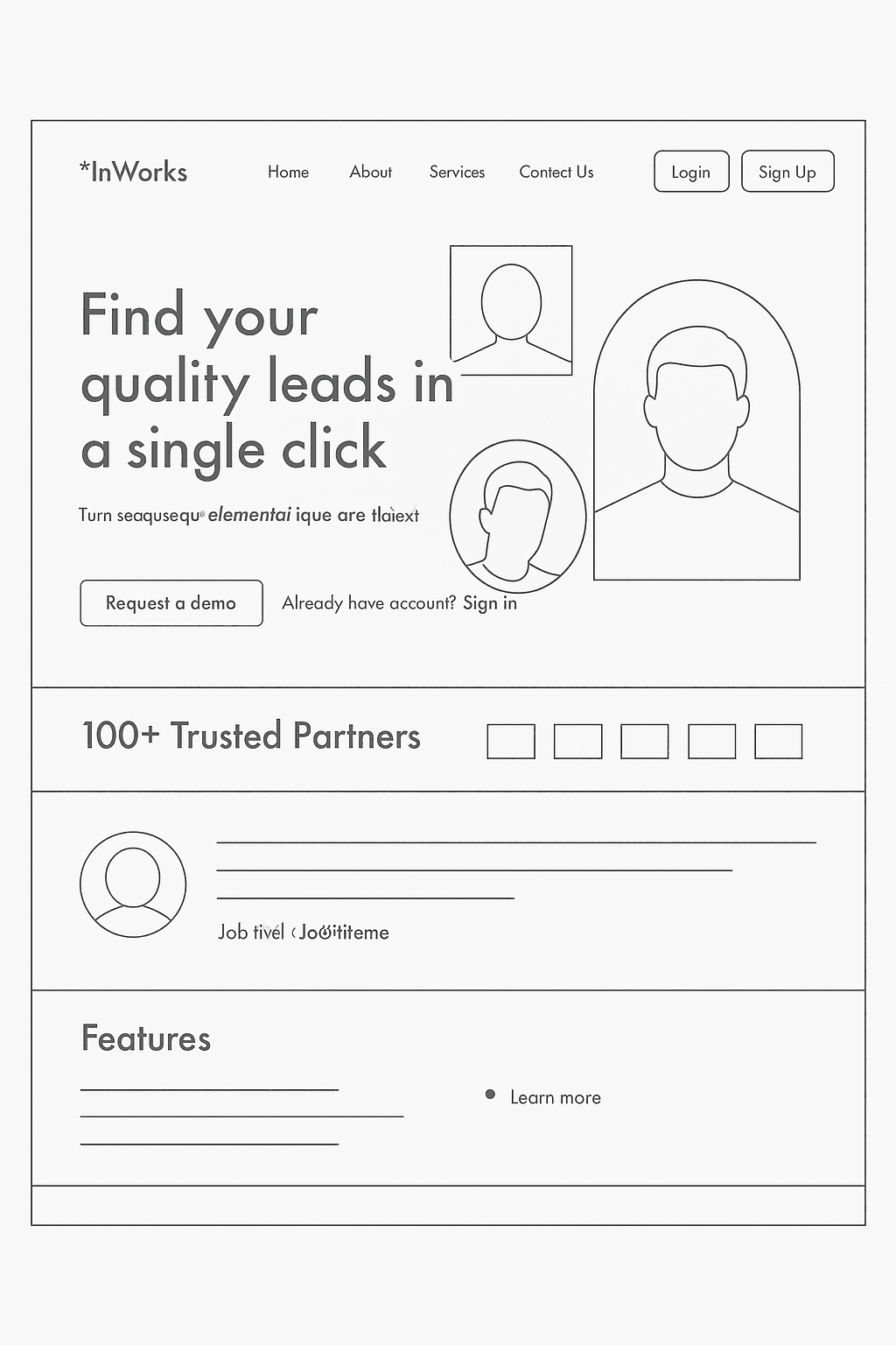
For InWorks, I designed a modern, high-impact landing experience that helps businesses discover quality leads with minimal effort. The challenge was to transform a basic wireframe into a visually engaging, conversion-focused interface that communicates clarity, trust, and value instantly. My design approach blended bold visuals, clean typography, playful accents, and strong hierarchy to create a memorable digital identity while guiding users toward the core actions—requesting a demo or signing up.
Problem
The existing concept lacked personality, structure, and a compelling narrative. Users arriving on the site needed:
A clear understanding of what InWorks does
Instant trust signals to validate credibility
A smooth path to conversion with fewer distractions
A visual tone that feels modern, confident, and human
Solution
I redesigned the landing page with a strategic UI/UX framework focused on engagement, clarity, and conversion.
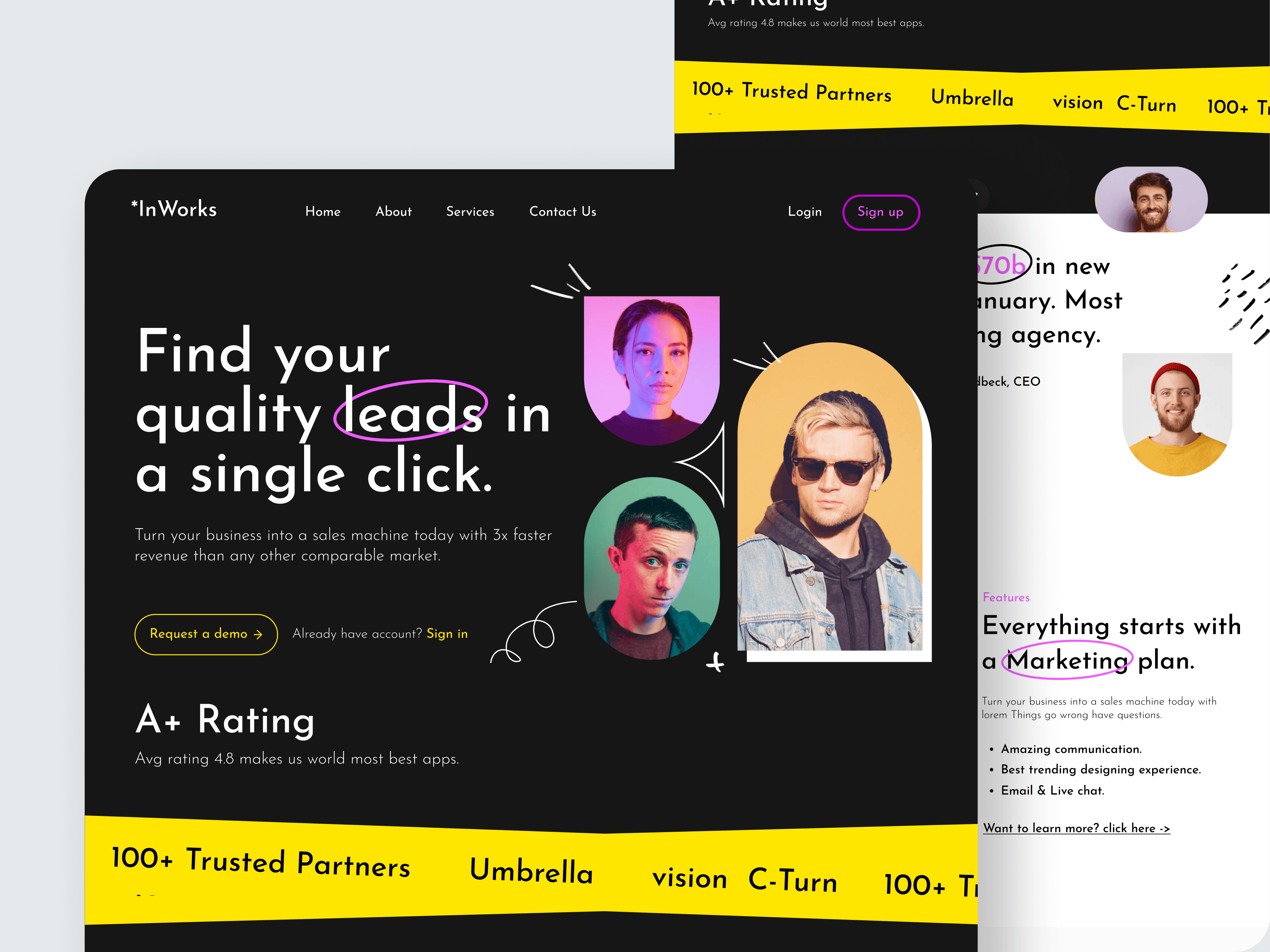
⭐ 1. Hero Section: Communicating Value in Seconds
The hero block delivers a bold, simplified message—“Find your quality leads in a single click”—supported by a vibrant visual system and a clear subheadline.
I incorporated:
Large, confident typography
Highlighted keywords (e.g., leads) to draw attention
Human imagery to create emotional connection
Two primary actions: Request a demo (priority) and Sign in
This area is crafted to instantly answer "What does this product do?" and "Why should I care?"
⭐ 2. Trust Indicators for Immediate Credibility
Right below the hero, I introduced:
A 100+ Trusted Partners section
Animated logos or simple badge-style icons
A short credibility statement (“A+ Rating”)
This reduces perceived risk and reassures users early in the funnel.
⭐ 3. Personality-Driven Visual Identity
To differentiate InWorks from typical corporate landing pages, I introduced:
High-contrast color theme (deep black + neon yellow/purple accents)
Hand-drawn strokes and circled text for a playful, expressive vibe
Cutout-style human portraits to humanize the brand
Subtle illustrations and movement to give the site energy
These touches create a bold, artistic brand personality aligned with creative, fast-moving businesses.
⭐ 4. Feature Breakdown for Clarity
The feature section shifts from generic bullet lists to a conversational, story-like layout:
Headlines that highlight benefits rather than features
Subpoints for clarity (e.g., “Amazing communication”, “Email & Live chat”)
Clean layout with plenty of white space for breathing room
This improves readability and keeps users engaged as they scroll.
⭐ 5. Simple, Conversion-Friendly User Flow
The UX flow is designed to minimize friction:
Hero CTA → Request a demo
Users see trust badges and product features on scroll
Additional CTAs appear in supporting sections
Smooth transitions between sections encourage deeper exploration
Every major section ends with a subtle invitation to continue.
Design Decisions
Typography: Strong serif headline paired with clean sans-serif body text for contrast and hierarchy
Color: Bright accent colors used sparingly to highlight conversions and draw attention
Spacing: Generous spacing ensures breathing room and premium feel
Illustrations: Hand-drawn elements help break monotony and improve visual storytelling
Button Style: Soft-rounded buttons with clear text and strong contrast for accessibility
Outcome
The redesigned landing page offers:
A clearer value proposition
Stronger trust and brand presence
A more intuitive flow that improves conversion likelihood
A unique, expressive visual identity that differentiates InWorks in a competitive market
The final result is a landing experience that feels modern, confident, and built for engagement.