My Works
Stream - Modern Event Discovery & Ticket Booking Experience


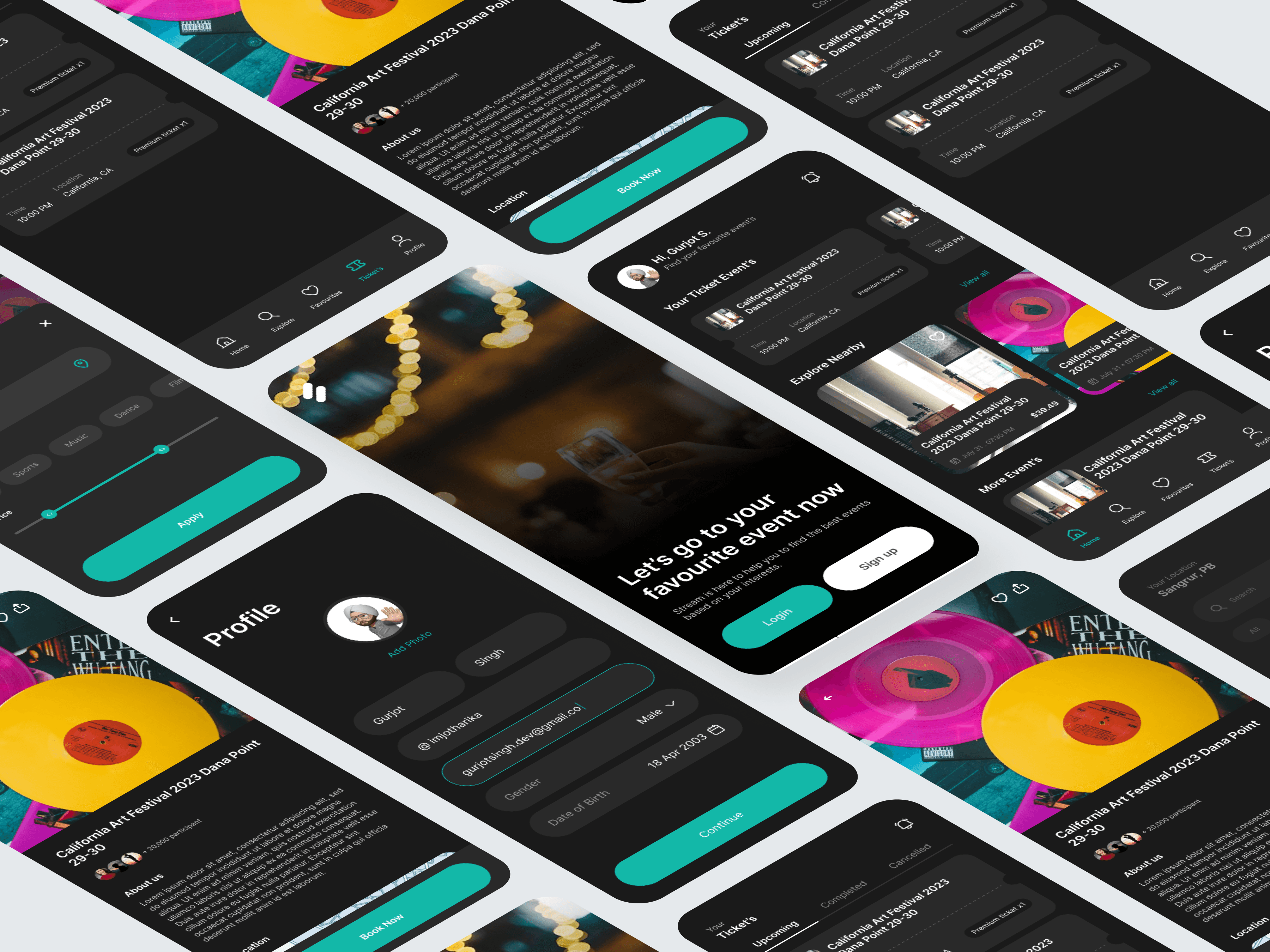
01 — Overview
This project focuses on designing a seamless end-to-end experience for discovering events, exploring nearby shows, booking tickets, and managing user profiles — all within one cohesive mobile app. The goal was to create a personalized, visually immersive, and intuitive event-booking journey that helps users find events that match their interests while making the process effortless and enjoyable.
The result is a clean, modern interface with a dark theme that elevates event visuals, improves focus, and creates a premium nightlife-inspired feel.
02 — Problem
Users who want to find and book events typically face a number of challenges:
Event discovery is often scattered across different platforms
Filtering and searching for the right event is cumbersome
Ticket management is confusing and lacks transparency
UI in many event apps feels outdated and overwhelming
Onboarding flows do not support personalization
This redesign aims to solve these pain points through clarity, personalization, and simplicity.
03 — Research Insights
User Motivations
Users want:
Quick access to events based on interests
A visually appealing way to browse upcoming shows
Reliable ticket storage and reminders
A straightforward booking process
Personalized recommendations
Business Requirements
Provide a highly engaging home feed
Encourage account creation for personalization
Support in-app ticket viewing and history tracking
Create a modern UI that differentiates from competitors
These insights shaped the core CX and UI direction.
04 — UX Strategy
1. Onboarding That Builds Trust and Personal Relevance
The onboarding screen uses:
A stunning background visual to immerse users
Clear CTAs (Login / Sign up)
Friendly messaging (“Let’s go to your favourite event now”)
This immediately sets the app’s tone — energetic, modern, and user-focused.
2. Personalized Home Screen for Instant Engagement
The home dashboard includes:
A personalized greeting (“Hi, Gurjot S.”)
A dedicated section for Your Ticket Events
Horizontally scrollable event cards for quick visual scanning
Clear date, location, and ticket type badges
This structure helps users re-engage with events they’ve booked and discover new ones.
3. Smart Event Discovery With Filters
The Explore section features:
Category tags (Music, Dance, Social, Conference, etc.)
A clean grid of large event cards
High-quality visuals that make browsing enjoyable
Favorites/heart option for quick saving
The layout encourages exploration while minimizing cognitive load.
4. Focus on Event Details for Better Booking Decisions
Each event page highlights:
Beautiful hero imagery
Date, time, and location metadata
Ticket pricing upfront
A clean “Book Now” CTA
About section for deeper context
The hierarchy focuses on trust and clarity, essential for high-intent conversions.
5. Streamlined Profile & Data Entry
The Profile screen includes:
Editable fields for name, email, DOB, gender
A clear “Add Photo” option
Large, easy-to-tap inputs
A bright confirmation button for progression
This flow reduces friction and promotes personalization.
6. Dark Theme for a Premium, Event-Centric Feel
The dark UI theme creates:
A high-contrast experience
A cinematic atmosphere
Emphasis on vibrant event artwork
Improved readability in nightlife environments
This visual approach makes the app feel modern and immersive.
05 — UI Design Decisions
Color Palette
Dark charcoal backgrounds for depth
Teal/aqua accents for strong visual hierarchy
White text for clean readability
Bright imagery to draw focus
Typography
Bold headings for quick scanning
Clean sans-serif body text
Consistent hierarchy across screens
Components
Rounded cards for events
Sliding filters
Tab bar for navigation
Floating icons for easy interactions
Microinteractions
Tap feedback on cards
Smooth scrolling transitions
Ticket tabs (Upcoming, Completed, Cancelled)
These details enhance usability and delight.
06 — Outcome
The redesigned mobile app delivers:
✓ A personalized and engaging event discovery journey
✓ Clean, modern visuals optimized for browsing and booking
✓ A frictionless onboarding + profile setup experience
✓ Clear event categorization for faster decision-making
✓ A complete ticket management system for users
✓ A visually rich interface that enhances the event atmosphere
The final product feels intuitive, enjoyable, and aligned with how modern users discover experiences.
07 — Reflection
This project strengthened my ability to:
Balance visual storytelling with functional clarity
Create strong information hierarchies in content-heavy screens
Design dark-mode interfaces with accessibility in mind
Build personalized experiences that increase engagement
Simplify complex flows like ticket management and event search
The app ultimately delivers a seamless and emotionally engaging experience for people looking to discover and enjoy events.