My Works
Interacta - Designing an AI-Powered Platform for Interactive Product Demos


01 — Overview
This project focused on designing a modern landing page for an AI-powered platform that allows teams to build interactive product demos in minutes. The objective was to create a clear, conversion-friendly UX that explains a complex product in a simple, compelling way—helping users understand the value instantly and encouraging them to sign up.
Starting from low-fidelity wireframes, I refined the structure, hierarchy, and messaging into a high-impact final design that blends motion, AI-themed visuals, and a clean layout to communicate innovation and ease of use.
02 — Problem
Teams today rely on multiple disconnected tools—Figma for design, Notion for documentation, Slack for communication, and screen-recording tools for demos. This fragmentation creates:
Inefficient workflows
Time-consuming demo creation
Inconsistent handoffs
Difficulty updating demos after product changes
The landing page needed to communicate how this AI-powered platform brings everything into one place, making demo creation fast, automated, and visually polished.
03 — Research Insights
User Needs
After exploring analytics patterns of similar SaaS products and reviewing high-performing landing pages, three major needs emerged:
Immediate clarity — users should understand the product in the first 3 seconds.
Social proof & credibility — essential for SaaS conversions.
A guided narrative — showing the product workflow in simple, visual steps.
Business Needs
Increase sign-ups with a clear CTA
Position the brand as an innovative AI solution
Visually demonstrate integrations with familiar tools
04 — UX Strategy
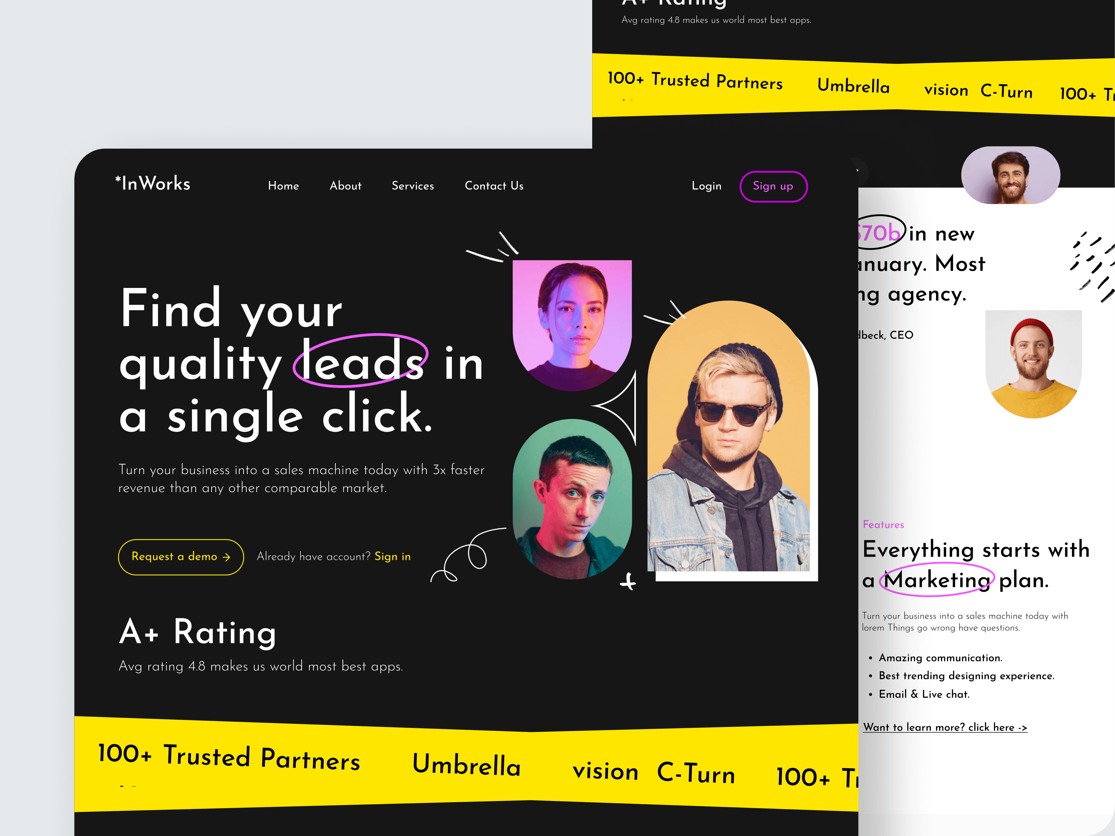
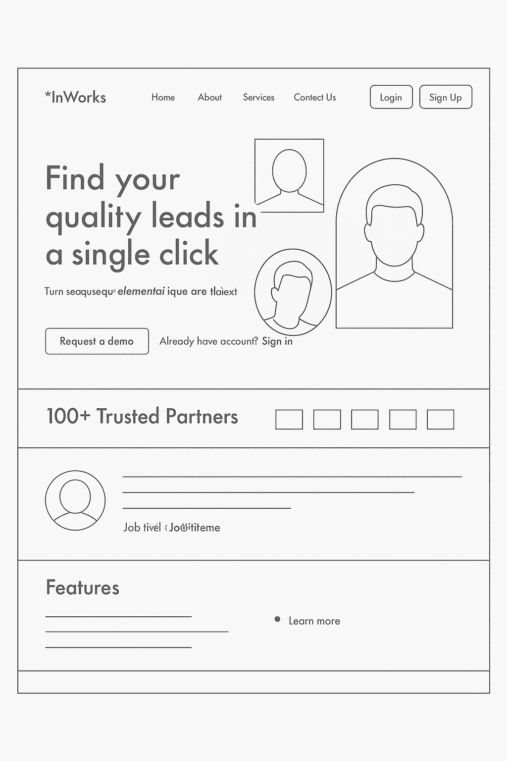
1. Turning the Wireframe Into a Scannable Hero Section
The wireframe defined a simple headline and product mock.
In the final design, I enhanced it with:
A bold, benefit-driven headline:
"Build AI-powered interactive demos in minutes."Subtext that communicates workflow reduction
A high-contrast “Get started for free” CTA
A soft sky gradient background that feels light, modern, and optimistic
Floating tool icons (Figma, Google Drive, Excel, Slack) to reinforce integrations
This approach provides clarity, emotional appeal, and visual delight.
2. Showing the Product Value Through Visual Storytelling
The landing page uses an interactive-style mockup that mimics a real demo window.
This helps users immediately visualize:
What they can create
How simple the workflow feels
How AI assists in building demos instantly
The layout intentionally avoids heavy text and lets visuals do the explaining.
3. Reducing Cognitive Load With Clear Sections
Each section of the landing page is structured around one clear message:
Problem: Switching between multiple tools
Solution: One unified AI-powered platform
Integrations: Tools users already rely on
Pricing: Three simple tiers
Social Proof: Showing adoption and trust metrics
Short paragraphs, light backgrounds, and icon-based visuals keep the page clean and digestible.
4. Designing for Conversion
I focused on three UX principles:
Consistent CTA placement ensures users always know where to take action.
Soft shadows and rounded cards give the UI a friendly, premium feel.
Readable rhythm and spacing guide the eye comfortably through each section.
The result is a landing page that feels simple but sophisticated—high-performing by design.
05 — Visual Design Decisions
Color Palette
Sky gradients evoke creativity & clarity
Deep blues communicate trust
Bright accents highlight action-oriented elements
Typography
Large, bold headings for clarity
Clean sans-serif body for readability
Proper contrast for accessibility
Imagery
Floating 3D icons create visual energy
Product mockups mirror real interface interactions
Subtle motion-like elements reinforce the “AI assistance” concept
06 — Outcome
The redesigned landing page successfully delivers:
✓ A smarter, more expressive visual identity
✓ A clear narrative from problem → solution → benefits
✓ A hero section that communicates value instantly
✓ Strong integration showcase to build trust
✓ A simplified pricing model that supports decision-making
✓ Increased clarity for users exploring an unfamiliar AI product
This concept demonstrates how UX, visual strategy, and product storytelling work together to make a complex SaaS solution feel simple, desirable, and easy to adopt.
07 — Reflection
This project strengthened my understanding of:
Designing for high-converting SaaS landing pages
Balancing aesthetic creativity with UX clarity
Using visual hierarchy to simplify complex ideas
Turning wireframes into expressive storytelling moments
Creating brand consistency across hero sections, features, and pricing
The final design feels modern, intuitive, and aligned with what users expect from next-generation AI tools.