My Works
Insightful - UX Case Study — A Clean, Modern Reading Experience for Writers & Developers


01 — Overview
This project explores a modern redesign of a reading and publishing platform focused on writers, developers, and tech enthusiasts. The goal was to craft a clean, calm, and reader-first experience, with improved discoverability, intuitive navigation, and a more personalized daily feed. My design process centered around simplifying how users browse content, follow authors, save articles, and manage their profile.
The result is a refined, minimal interface that blends editorial-style typography with modern UI patterns—creating a reading experience that feels elegant, distraction-free, and deeply personal.
02 — Problem
Existing reading apps often struggle with:
Cluttered layouts that overwhelm new readers
Low personalization, making it difficult to find relevant articles
Complex navigation, especially between feed, explore, bookmarks, and profile
Unfriendly onboarding, causing users to drop before exploring meaningful content
The challenge was to create a mobile experience that balances content density with clarity, helping users read more, explore more, and connect more deeply with authors.
03 — Research Insights
I conducted a combination of competitive analysis (Medium, Hashnode, Substack) and user observations from existing reading platforms.
Users Needed:
A personalized home feed that feels curated
A faster way to navigate categories like iOS, Design, Startup, Development
A clean article reading space with strong readability
Easy access to saved articles and followed authors
A profile page that feels expressive yet minimal
Pain Points Identified:
Browsing takes too many taps
Visual noise reduces reading comfort
Article lists lack hierarchy, making scanning difficult
Bookmarking and following flows feel hidden
These insights shaped a design direction focused on calm UI, clear navigation, and structured content hierarchy.
04 — UX Strategy
1. Personalized Daily Feed
The home screen was redesigned to greet users with a warm, familiar interface:
Personalized header (“Hi, Gurjot!”)
Tabs for For You, Following, Design, Startup
Beautiful article previews with clear metadata (author, date, image)
This gives users a feeling of ownership over their reading journey.
2. Explore Page with Strong Hierarchy
The Explore screen uses:
A top search bar
Ranked list layout (1, 2, 3...)
Compact article previews for fast scanning
This helps users quickly discover trending posts across categories.
3. Elegant Article Reading Experience
I emphasized readability by designing:
Large, comfortable typography
Generous margins and line spacing
Clean UI icons for clap, save, and share
Simplified top navigation with author info
The goal was to make long-form reading feel effortless, similar to editorial-quality platforms.
4. Thoughtfully Designed Profile Page
The Profile screen highlights the writer’s identity and content:
Circular avatar and short bio
Follower/following count
Organized list of authored articles
Easy “Edit Profile” access
This design gives creators a polished space to showcase their writing and connect with readers.
5. Bookmarking & Empty States
A customized empty state illustration helps guide new users who haven’t saved any articles yet.
This improves engagement and reduces dead-end experiences.
6. Guided Onboarding
A simple onboarding card encourages new users to join the conversation through comments and claps.
This early engagement increases retention and makes readers feel like part of a community.
05 — Visual Design Decisions
Typography
Serif headlines combined with clean sans-serif body text
Editorial feel without sacrificing modern usability
Color Palette
Soft neutrals for calm reading
A bold green accent for branding
Smooth gradients for warmth and personality
Layout & Spacing
Generous padding for breathability
Rounded containers for friendliness
Consistent card structure for article lists
06 — Key Screens
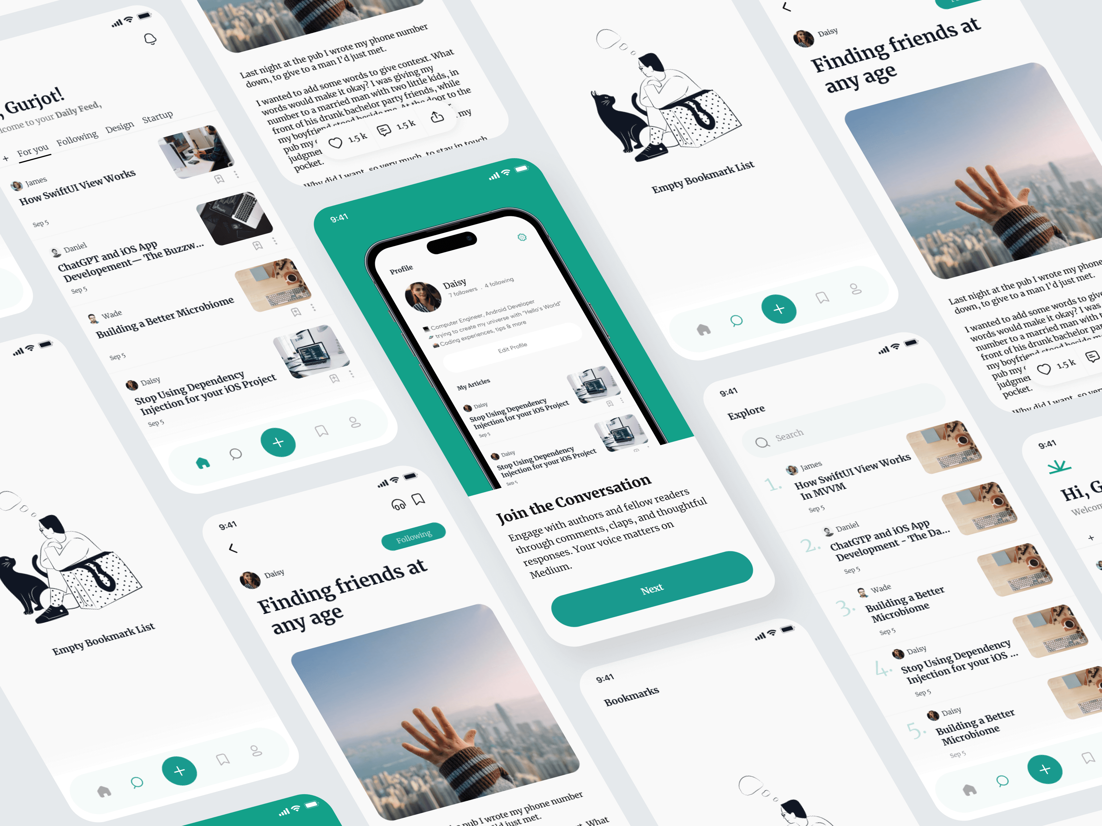
Home Feed
Personalized, structured, and easy to navigate.
Explore Page
Ranked layout + search for fast discovery.
Article Screen
Minimal, immersive, and distraction-free.
Profile Screen
Identity-focused, elegant, and clean.
Bookmarks & Empty State
Simple prompts that guide the user toward action.
07 — Outcome
The final experience delivers:
✓ A calm, editorial reading experience
✓ Faster content discovery through strong hierarchy
✓ A personalized daily feed that encourages routine use
✓ Cleaner navigation with a clear four-tab structure
✓ A profile system that empowers creators
✓ Meaningful empty states and onboarding to guide new users
The app caters to both readers and writers, making the ecosystem feel thoughtful, inspiring, and beautifully functional.
08 — Reflection
Designing this project helped refine my approach toward:
Creating balanced UI that serves different user types
Prioritizing typography and spacing for long-form content
Using personalization to increase engagement and retention
Simplifying navigation while maintaining depth
Crafting calm visual experiences that elevate the reading journey
This case study strengthened my skill in designing content-focused mobile environments and thinking from the perspective of both creators and readers.