My Works
Headline – A Modern, Personalized News Experience


01 — Overview
Headline is a mobile news app designed for users who want fast, personalized, and distraction-free news consumption. The goal of this redesign was to create an interface that feels modern, calm, and reliable while reducing cognitive overload often seen in typical news apps.
I was responsible for analyzing user frustrations, restructuring information architecture, and designing high-fidelity interfaces that simplify news discovery and reading.
02 — Problem
News apps today suffer from several UX issues:
Information overload from cluttered layouts
Poor personalization, making it hard to find relevant stories
Low readability due to dense layout and aggressive ads
Weak engagement patterns, causing users to drop off quickly
Goal:
Create a news experience that is clean, curated, and easy to navigate, with strong emphasis on readability and personalization.
03 — Research Insights
User Needs
A calm design with reduced clutter
Ability to browse topics quickly
Clear separation between content sections
A smooth reading experience without distraction
Simple onboarding and category selection
Competitive Analysis
Apps like Apple News, Inshorts, and Google News influenced several UX decisions:
Card-based browsing increases scanning speed
Category filters reduce cognitive load
Minimalistic design improves reading focus
04 — UX Strategy
1. A Calm, Minimal Home Feed
The feed combines:
A clean white background
Lightweight fonts for smooth scanning
Trending section with horizontal scroll for quick exploration
Category chips (All, Business, Crypto, Technology, etc.) for instant filtering
This reduces mental effort and makes the experience feel structured and breathable.
2. Elevated Reading Experience
The article page was designed for maximum readability:
Big, bold headline
Generous line height and spacing
Uninterrupted vertical reading flow
Interaction metrics (likes, comments, shares) displayed subtly
A clear “Follow” button to build interest-based personalization
The focus remains on the content, not the interface.
3. Clear & Familiar Navigation
A bottom navigation bar ensures quick access to:
Home
Search
Saved articles
Profile
This follows iOS conventions, minimizing learning curve and supporting fast engagement.
4. Personalized Onboarding
The onboarding and sign-in screens follow a minimal, trust-building aesthetic:
Friendly brand illustration/logo
Clean CTAs with high contrast
Simple sign-in and sign-up flow
Users can immediately start customizing news categories, improving long-term retention.
5. Premium Upgrade Flow (Headline+)
To encourage monetization:
A clear benefits list highlights value (no ads, exclusive content, early features)
A modern, minimal UI makes the offer feel premium
The pricing screen uses soft green checkmarks to communicate clarity and trust
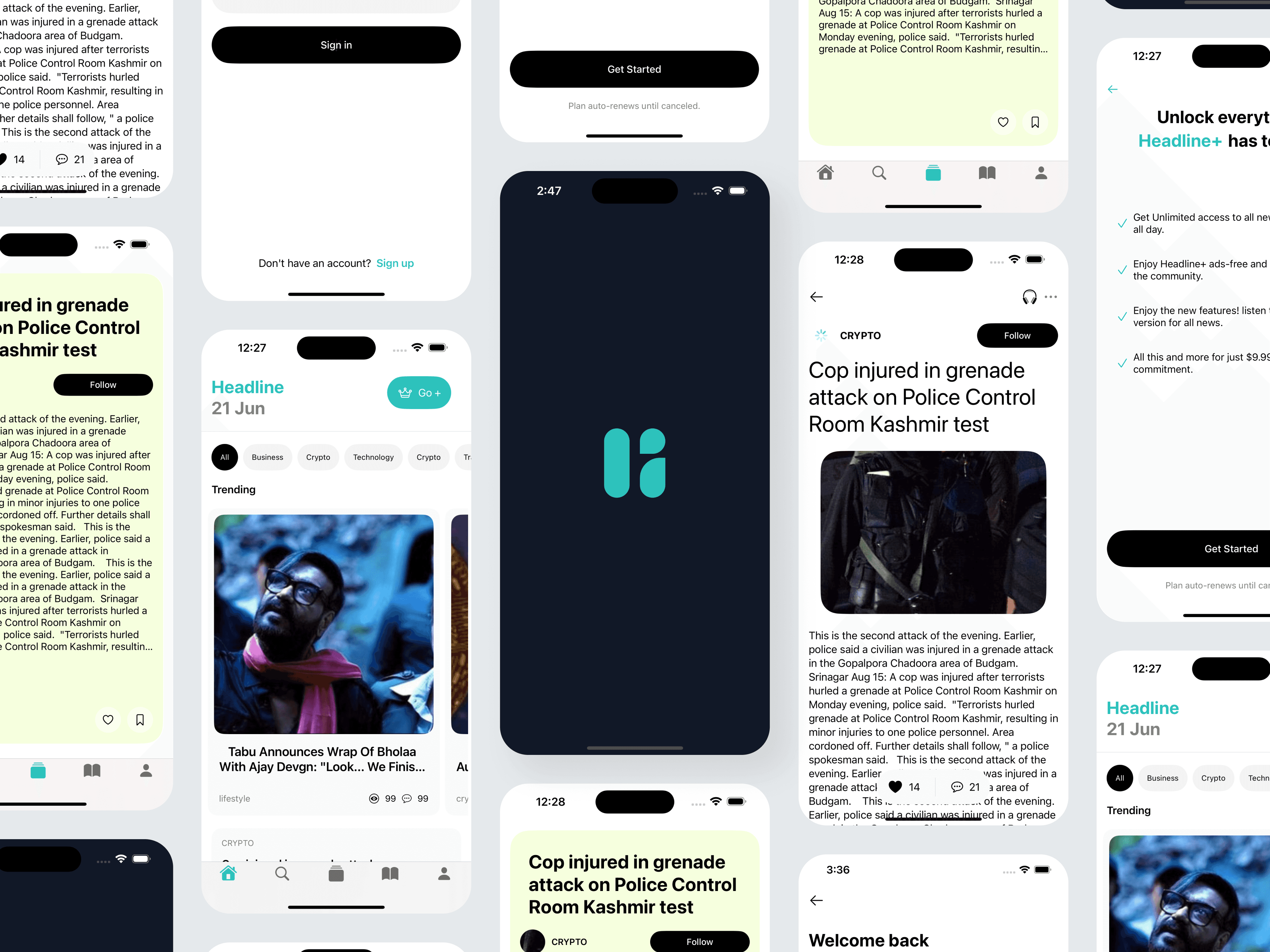
05 — Key Screens
Home Feed
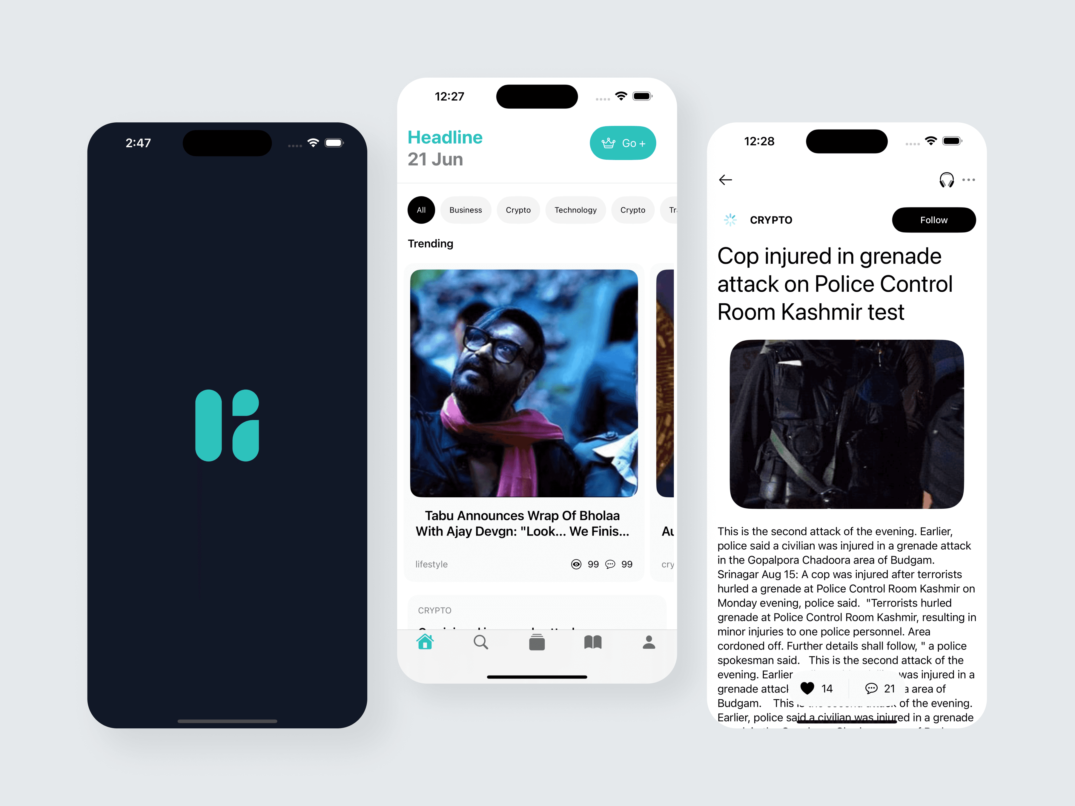
Smart categorization, trending stories, and card-based layouts offer a structured browsing flow.
Article Page
Optimized for reading clarity, with smooth vertical flow and minimal distractions.
Onboarding & Premium Screens
Simple, transparent upgrade flow highlighting user value
06 — Design Decisions
Color Palette
Teal accents for freshness and brand identity
Black/white neutrals for readability
Soft greys for layering without clutter
Typography
Large bold headlines for hierarchy
Medium-weight body text for comfortable reading
Small icons + micro-interactions for added clarity
Layout Principles
Edge-to-edge cards
Ample white space
Consistent spacing rules
Accessible tap targets
07 — Outcome
This concept successfully delivers:
✓ A calm, minimal, and premium reading experience
✓ Fast scanning with category-based filtering
✓ Strong readability improvements
✓ Seamless onboarding and clean monetization flow
✓ A visually consistent mobile design system
Users can discover and consume news faster, easier, and with less cognitive overload.
08 — Reflection
Working on Headline reinforced the importance of:
Clear hierarchy and spacing for reducing cognitive load
Designing for reading comfort over visual complexity
Creating personalization pathways early in the journey
Balancing business goals (subscriptions) with user experience