My Works
Autonix – Smarter Auto Repair Experience


01 — Overview
Autonix is a modern auto-repair service focused on transparency, quality, and speed.
The goal of this redesign was to create a clean, trustworthy, and premium-feeling website that reflects Autonix’s expertise while making it easier for customers to book service appointments.
My role was to design the end-to-end user experience—from information architecture and user flows to the final high-fidelity interface.
02 — Problem
Auto-repair websites often feel outdated, cluttered, and untrustworthy.
Users face challenges like:
Difficulty finding key information (pricing, services, credibility)
Lack of transparency about mechanics and service quality
Complicated booking processes
Stale visuals that don’t match the premium quality of modern repair centers
Goal:
Design an interface that builds trust instantly and guides users to take action—primarily “Service Now” bookings.
03 — Research Insights
User Needs
A clear understanding of available services
Visible proof of credibility (mechanic profiles, certifications)
Simple, no-stress booking flow
Assurance their vehicle will receive professional care
Business Needs
Increase online bookings
Showcase service expertise
Establish a strong visual brand identity
04 — UX Strategy
1. Hierarchy Built Around Trust
The hero section includes:
A direct value proposition: “Smarter auto repairs for every driver.”
Sub-text that explains reliability + expertise
Strong, highly visible CTA: Service now
A clean grid layout that reinforces precision & professionalism
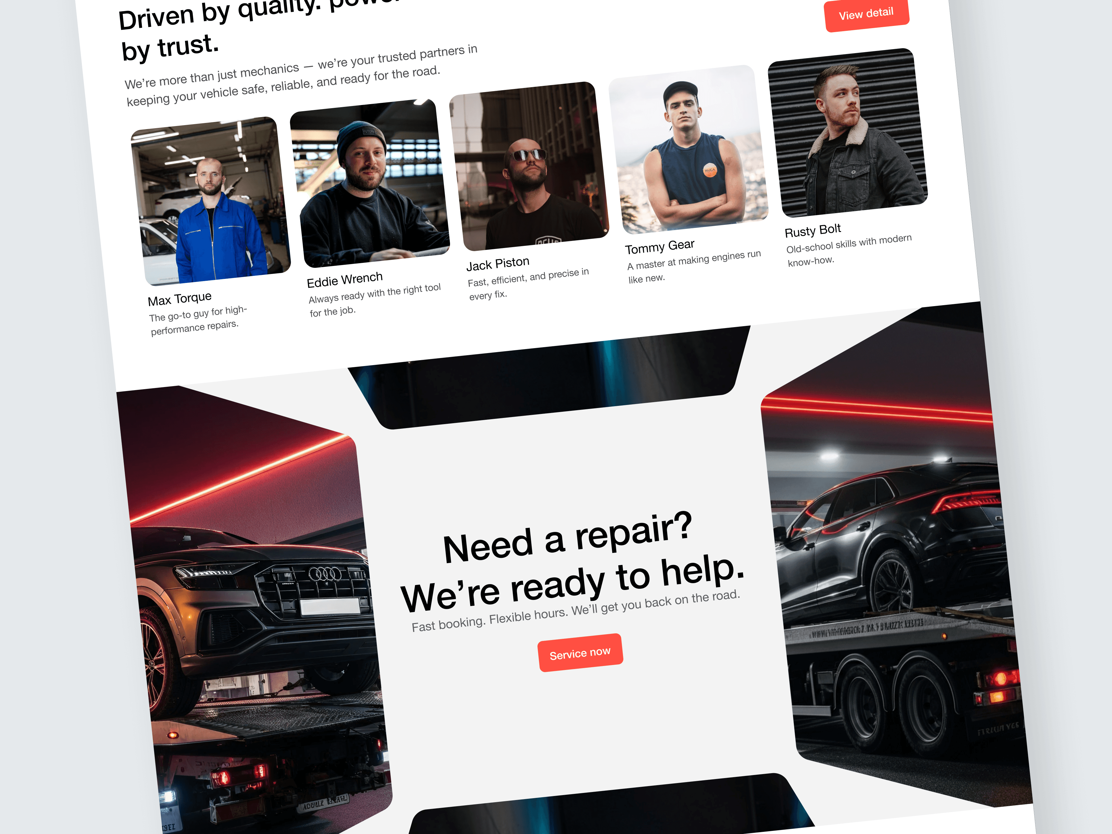
2. Visual Proof & Human Connection
To reduce friction and skepticism, I introduced:
Technician profiles with real photos
Short, friendly descriptions
A “View detail” mechanic overview call-to-action
This instantly humanizes the brand and builds trust.
3. Benefits Section That Feels Premium
The mid-section uses:
A circular infographic representing “Our points”
Iconography and emojis for approachability
Service highlights like:
Expertise you can trust
Comprehensive services
Quality & reliability
4. Content Layout With Confident, Clean Spacing
Large typography, neutral spacing, and minimalistic design choices help the brand feel:
Professional
Confident
Reliable
Modern
5. High-Impact Imagery
The website uses cinematic workshop and vehicle photos to create emotional appeal.
This visual approach reinforces:
Precision engineering
Premium-level service
Safety & reliability
05 — Key Screens
Hero Section
Clear USP
Strong primary action
Subtle grid overlay to signal structured, precise service
Mechanic Profiles
Builds trust through authenticity
Presents expertise visually
Service Reliability Section
Circular data visualization representing service thoroughness
Cards outlining key value pillars
Booking CTA Section
Large, confident typography
“Service now” CTA placed strategically
Designed for both mobile and desktop efficiency
06 — Design Decisions
Typography
Bold headlines build authority
Light body text enhances readability
Emphasis on clarity over decoration
Color Palette
White background for clean and modern feel
Soft greys for depth
Vibrant red accent for CTAs, aligning with automotive energy and urgency
Grid System
Strict grid layout supports the mechanical, precise nature of the brand
Creates visual consistency across sections
07 — Outcome
The redesigned interface:
✓ Increased user trust through mechanic profiles and clean layout
✓ Delivered a premium, modern experience aligned with automotive standards
✓ Reduced friction in service booking with a strong CTA and simple structure
✓ Created a visually stunning identity that differentiates Autonix from competitors
This concept demonstrates how UX and visual design can work together to transform a traditional automotive business into a refined, user-friendly brand.
08 — Reflection
This project strengthened my approach to:
Designing trust-oriented digital experiences
Creating clear hierarchy in content-heavy layouts
Using photography strategically to communicate brand values
Balancing minimalism with strong visual impact